Daytona Bench Ads: Color Psychology 101
When designing the look for your bench ad campaign, you will likely run into a few questions about color. What goes well together? What’s the average commuter likely to notice?
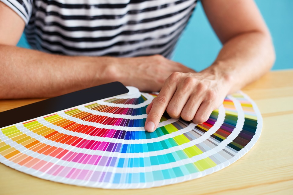
Just like any aspect of design, color choice matters because it’s part of what attracts views for your ad. With that being said… do you know the psychological subtleties behind the colors, and what different colors might say about your business? In today’s blog, we are looking at the emotional meanings behind popular color choices, to help you make design decisions that work for your business.
Red
As you might have guessed, red is an intense, emotional and passionate color. It energizes people and stands out, so it’s perfect for getting across a bold message or personality.
Orange
While less frequently used than its more passionate color cousin, red, orange (especially bright orange) is all about optimism and making social connections. It combines the power of red with the brightness and happiness of yellow, so what else would you expect?
Yellow
As we’ve just mentioned, yellow is a happy color. It takes a clever design scheme to use yellow correctly, however, since the color can often be overpowering or not seen at all when used in low-contrast settings.
Green
The color green is often used to symbolize nature and earthiness. A company that uses green heavily in its promotional materials might be especially down to earth or focused on natural, environmentally friendly endeavors. Today, green is also used as a modern color that represents the creativity and possibility behind social media, websites and modern technology.
Blue
Blue is often used in ads—from bench ads to online adverts and everywhere in between—because of its soothing effect. This is a cool, relaxing color that can make your business more tranquil and appealing in viewers’ eyes.
Purple
Purple is all about royalty, romance and creativity. It can often produce a positive reaction in viewers’ minds and make your business seem more inviting or “in-touch” than other colors can.
Pink
Because pink is often associated with femininity, it is often used for companies with services geared toward women. However, pink is slowly becoming a popular “stand-out” color choice for all types of businesses, so don’t write it off right away!
Black
Because it is such a dark color, black is best used for the text on your bench ad or select accented parts. It can be used as the primary color in ads for companies who want to make a bold statement.
White
Every ad needs a little (or a lot of) color, but almost every one also turns to white for balance and visual breathing room.
Gray
Gray is another color best used in moderation. While, as a neutral, it can help to balance out overly colorful ads, it can also be seen as dark or depressive when used too much.
Brown
Another neutral, brown is a color most often associated with natural, grassroots companies and organizations. Just like trees, soil and roots, the color brown is especially apt at highlighting the qualities of a handmade/homegrown product or service.
Remember, you should use the above color meanings as inspiration, but not necessarily the absolute guide on colors for your logo or bench ad. Ultimately, only you can decide what colors best represent your business—we just want to help make the process a little bit easier! As always, be sure to contact us at (386) 322-3600 if you are interested in starting (or adding to) a local bench ad campaign.
Bookmark & Share
User Comments
Be the first to comment on this post below!
Previous Article
Next Article
Most Popular Articles
- The 4 Key Qualities of All Great Logos
- Where to Direct Customers in Your Bench Ad
- Habits for Creativity
- Understanding the 5 C?s of Ad Design
- Central Florida Bench Ads: Choosing the Right Font
- Design Mistakes and How to Avoid Them
- An Eye for Design: Inspiration Wherever You Go
- 5 Signs of a Successful Ad Design